VideoStack
The Header customization panel for the VideoStack widget allows you to configure and align the top introductory section displayed above your video review carousel.
Header
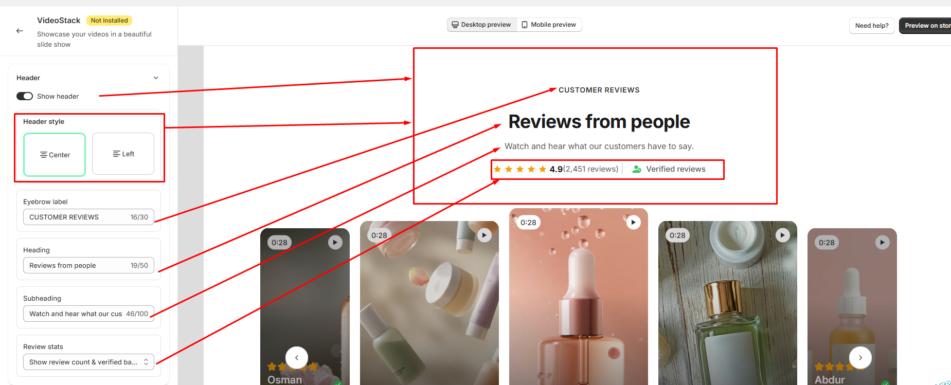
The Header section allows you to customize the heading area displayed above the review slider.
- Show header: Turn this on to display the ReviewReel header section. Turn it off to hide the entire header.
- Header style — choose how the header content is aligned
- Center: Aligns the header content to the center.
- Left: Aligns the header content to the left.
- Eyebrow label: Customize the small label displayed above the main heading, such as "CUSTOMER REVIEWS."
- Heading: Customize the main heading displayed in the ReviewReel section, such as "Reviews from people"
- Subheading: Customize the supporting text displayed below the main heading.
- Review stats: Choose which review information is displayed in the header, such as the review count, average rating, and verified reviews information.
Display elements
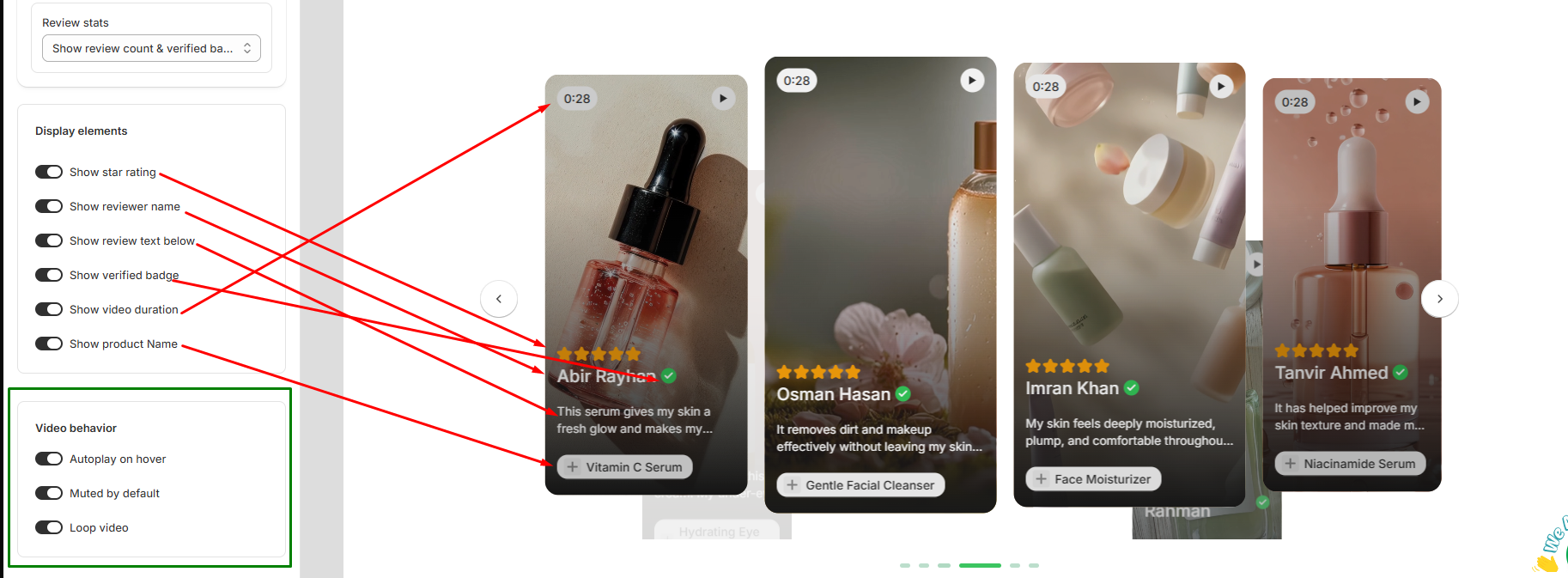
- Show star rating: Toggle to display or hide the yellow star review score on each video card (e.g., 5-star icons).
- Show reviewer name: Toggle to display or hide the reviewer's name (e.g., Abir Rayhan).
- Show review text below: Toggle to show a snippet of the customer's written review text beneath their name.
- Show verified badge: Toggle to display a green checkmark icon indicating a verified buyer.
- Show video duration: Toggle to display the video length overlay in the top-left corner (e.g., 0:28).
- Show product Name: Toggle to display a tag showing the reviewed product at the bottom of the video card (e.g., + Vitamin C Serum).
Video behavior
- Autoplay on hover: Toggle to start playing the video automatically when a customer hovers their mouse cursor over the video card.
- Muted by default: Toggle to play videos without sound initially, ensuring a seamless and non-intrusive browsing experience.
- Loop video: Toggle to make videos play continuously on a loop once started.
Color
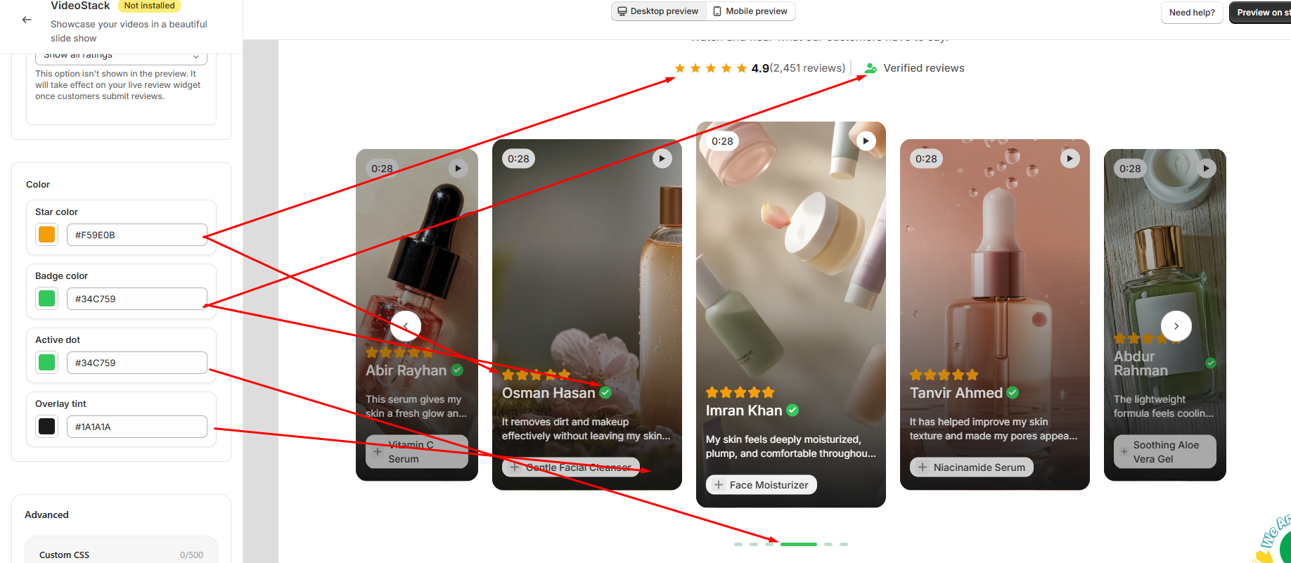
- Star color: Sets the color for the rating stars displayed both in the top header summary and on individual video cards (e.g., #F59E0B).
- Badge color: Controls the accent color for the "Verified reviews" badge in the header and the verified checkmark icons next to reviewer names (e.g., #34C759).
- Active dot: Sets the indicator color for the currently active slide in the bottom pagination carousel (e.g., #34C759).
- Overlay tint: Controls the dark background gradient/tint applied over video cards to ensure reviewer text, names, and product tags remain clear and readable (e.g., #1A1A1A).
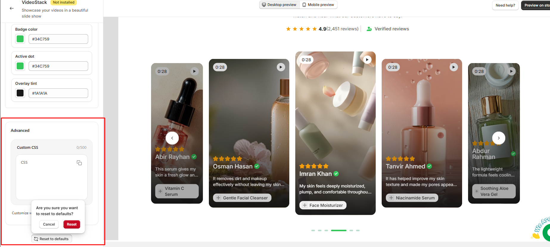
Advanced
The Advanced section provides additional customization options for the review widget.
- Custom CSS: Add your own CSS code to customize the appearance and styling of the review widget beyond the available settings. You can use custom CSS to make more specific design adjustments to match your store's theme.
- Reset to defaults: Reset all review customization settings to their default values. A confirmation is required before the settings are reset.