ReviewHub
ReviewHub is a customizable customer review and testimonial section that helps you showcase authentic customer feedback on your storefront. Display star ratings, review counts, verified badges, and customer media to create a professional and trustworthy review section for your shop.
Header
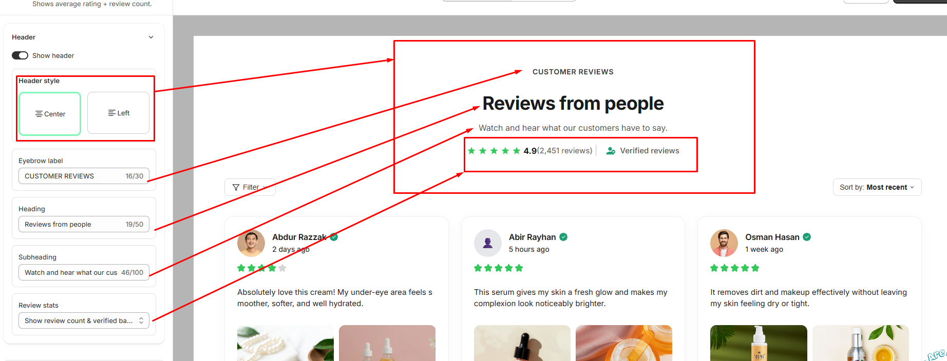
The Header section allows you to customize the heading area displayed above the review slider.
- Show header: Turn this on to display the ReviewReel header section. Turn it off to hide the entire header.
- Header style — choose how the header content is aligned
- Center: Aligns the header content to the center.
- Left: Aligns the header content to the left.
- Eyebrow label: Customize the small label displayed above the main heading, such as "CUSTOMER REVIEWS."
- Heading: Customize the main heading displayed in the ReviewReel section, such as "Reviews from people."
- Subheading: Customize the supporting text displayed below the main heading.
- Review stats: Choose which review information is displayed in the header, such as the review count, average rating, and verified reviews information. displays customer reviews in a visual slider, allowing customers to browse reviews with images and videos directly on the storefront.
Display Elements
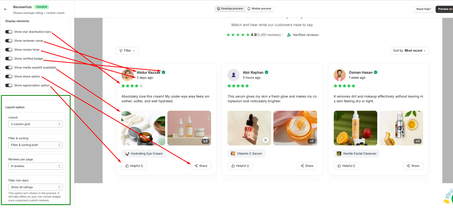
- Show star distribution bars: Turn this on to display star ratings for each customer review. Turn it off to hide the star ratings.
- Show reviewer name: Turn this on to display the name of the customer who submitted the review. Turn it off to hide the reviewer name.
- Show review timer: Turn this on to display how long ago the review was submitted (e.g., 2 days ago). Turn it off to hide the submission time.
- Show verified badge: Turn this on to display a verified icon next to verified reviewer names. Turn it off to hide the verified badge.
- Show media asset (if available): Turn this on to display customer-uploaded photos or videos alongside their reviews. Turn it off to hide media assets.
- Show share option: Turn this on to display a share button on each review card. Turn it off to hide the share button.
- Show appreciation option: Turn this on to display a helpful/appreciation button on each review card. Turn it off to hide the appreciation button.
Layout Option
- Layout: Select the grid structure (e.g., 3 column grid) to change how reviews are laid out across the section.
- Filter & sorting: Choose whether to display filtering options, sorting options, or both above the review grid.
- Reviews per page: Set the maximum number of customer reviews displayed per page before pagination.
- Filter min stars: Select the minimum star rating required to show a review in this section, or choose "Show all ratings" to display all submitted reviews.
Color
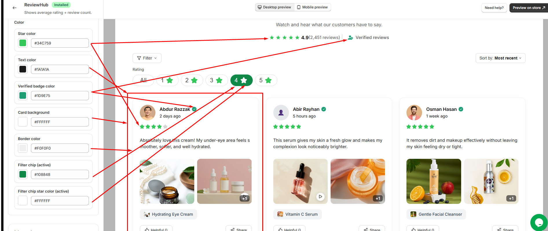
- Star color: Select the color for the star ratings displayed across review cards and review statistics.
- Text color: Choose the primary font color for review text, reviewer names, review data, and other labels.
- Verified badge color: Select the color for the verified icon and badge displayed next to verified reviews.
- Card background: Choose the background color for individual review cards.
- Border color: Select the border color for surrounding review cards and UI elements.
- Filter chip (active): Choose the background color for the currently selected rating filter button.
- Filter chip star color (active): Select the color of the star icon inside the currently selected filter button.
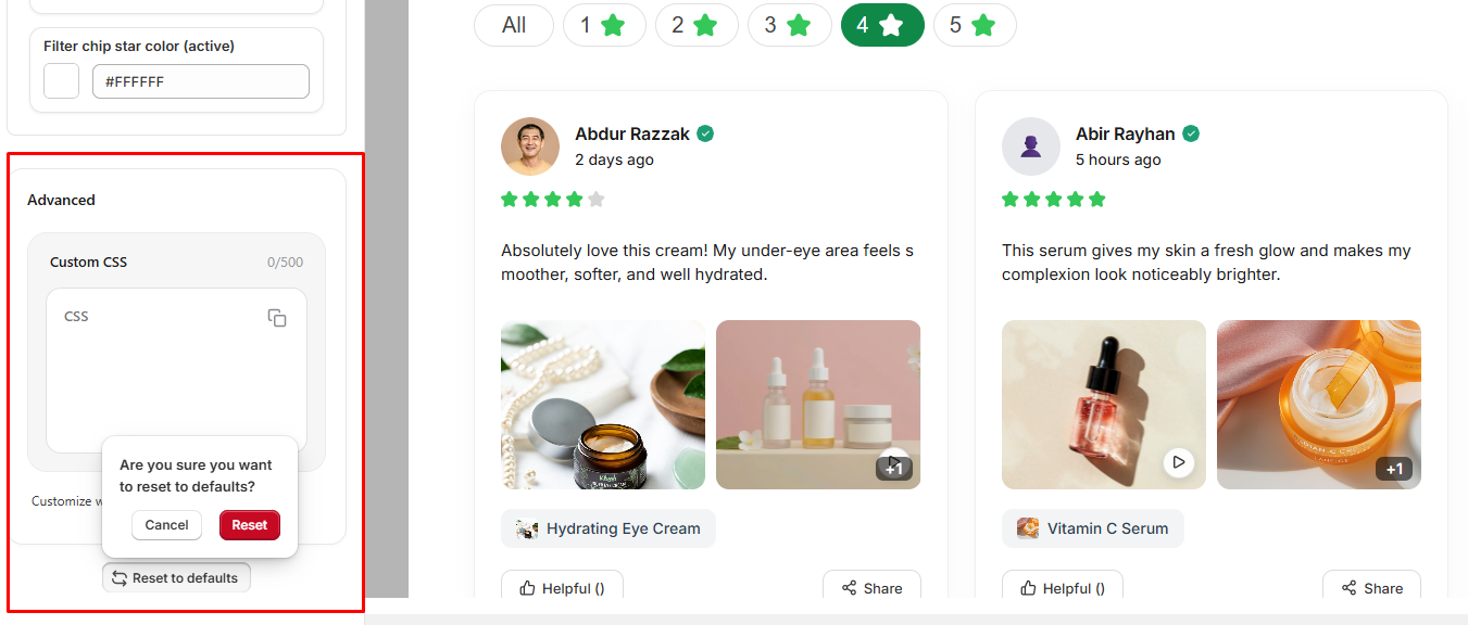
Advanced
The Advanced section provides additional customization options for the review widget.
- Custom CSS: Add your own CSS code to customize the appearance and styling of the review widget beyond the available settings. You can use custom CSS to make more specific design adjustments to match your store's theme.
- Reset to defaults: Reset all review customization settings to their default values. A confirmation is required before the settings are reset.